
Back to basics: contrast for photographers
Why is contrast important?
Using contrast is one way of controlling how interesting your photograph is. Does your viewer’s eye slip over your photograph and move on to the next thing or does something hold their attention and take them further into your image?
There are three main types of contrast you can manipulate: tones, colour and themes. Compare these two shots:


The first scores “low” in each of the contrast types:
Low tonal contrast (not much difference between the darkness of the darkest parts and the lightness of the lightest parts; they are similar shades of blue-grey).
Low colour contrast (all blue-grey colours).
Low thematic contrast (it’s a very still image with no real impact emotionally).
The second scores the same for both colour and thematic contrast but the image has been made more visually interesting by boosting just the tonal contrast: the dark areas have been made darker and the light areas lighter. This was done in post-processing: the histogram was simply stretched in Lightroom.
You can be on the look-out for high-contrast images at the time you make them or, with varying degrees of success, you can increase the contrast when you post process. For tonal images use the histogram controls and for colour contrast tweak the hue/saturation/luminance options. To increase the thematic contrast after the shutter has been pressed the crop tool is probably your only option, so if you want to explore this version of contrast it is best to get it right at the time you take the image.

Join A Year With My Camera
Emma’s flagship photography course is packed full of tips like these to take your photography from boring to fascinating. Join here (the email version is free) and get started today:

Tonal contrast for photographers
Keep one eye on the histogram and be sure to include a range of tones from black all the white to white in your image. Do this literally if you haven’t tried it before: work in black and white.

An image with low tonal contrast: notice how it looks a bit faded, a bit uninteresting. It’s because there aren’t any dark darks nor any bright brights.

This high tonal contrast image pops off the page in comparison.
Colour contrast for photographers
Get to know the colour wheel and use it to your advantage. Pick colours opposite each other on the wheel (“complementary” colours) for more contrast and choose those next to each other (“analagous” colours) for less contrast.

An image with low colour contrast.

An image with high colour contrast.
Thematic contrast for photographers
This concept is a little more difficult to achieve. How can you use visual cues to introduce the idea of a thematic contrast? Is your photograph showing a dull idea? Or is it trying to be more challenging; more interesting? The contrast here is in the mind of your viewer: can you hold their attention with something that contrasts with the status quo?
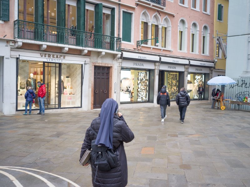
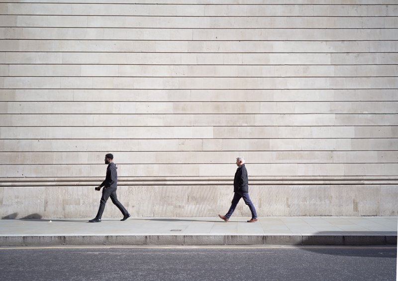
A simple example: compare these two photographs of “people in the city”. One, in Venice, is made from an unremarkable angle and just shows a mix of people going about their business. But the second, in London, uses a clean background and a deliberately square-on angle to emphasise the ideas of “smallness” and “insignificance”:
There is no “right” or “wrong” way to do this third idea, but have a go at nudging your viewer away from the easy, the comfortable, the low contrast thought.